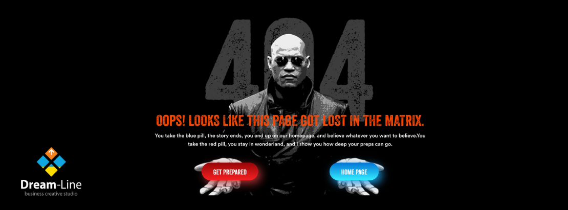
Most people don't care much about the 404 page, but this page can be put to good use.
A 404 page is an error page that users land on when they try to access a page that is not on your website.
This situation occurs due to an outdated link or an incorrectly entered URL, but in any case, visitors periodically see this page.
The good news is that the 404 page doesn't have to be the client's final page. It can also drive visitors to a conversion by keeping them on your website.
404 page should match the overall style of the site. Don't make it boring by just putting "Oops, something went wrong" text and don't scare customers away. To motivate the user to linger and see more information, the page should be bright and offer alternative options.

Add a call to action.
How to make a difference – create a targeted call to action.
There are many calls to action that you can use, you just need to decide what suits your brand.
The most popular call to action examples you can use are:
- Subscribe to email newsletter.
- Follow the news on social networks.
- Popular blog posts.
- Popular Pages.
- Add a way for people to report a broken link.
- Link to catalog.
- Link to promotions page.
The purpose of a call to action is for the user to stay on the website and be able to find what they are looking for. If your goal is to increase your social media following, then it makes sense to send visitors there, but be aware that they leave the website after that and may not return.
Use such pages to your advantage, but remember that the visitor came to the site for a specific purpose, it is better to minimize the number of such transitions. And we know how to do it ;)
Make sure 404 is not indexed by Google
While the point of this post is to show you how to put the 404 page to good use, we don't want more people to land on that page than we need to, right?
This means that you will need to make sure that the 404 page is not indexed by Google or some other search engine.
Other features on the 404 page
Other features you can include on your 404 page include:
- Search bar.
- Contact information (email address, telephone number, etc.).
- Menu.
- Link to home page.
Increasingly, the 404 page takes on an extraordinary design, some sites even make it interactive with animations or mini-quests.
.png)
The main thing is not to overload visitors with a million options (otherwise they may not choose a single one!). Remember, each user came to the site for a specific purpose, and each page is a step towards conversion.
Even though we make your 404 page spectacular and engaging, we still want to minimize the number of broken pages. So, do not forget to periodically check the site for broken links.


